


Every long-term EV load forecast has to answer the same question: of the drivers who will own an EV in 2046, how many plug in the moment they get home, and how many wait for an off-peak window?
The answer is usually expressed as a mix over a small set of charging strategies. The forecast S&P Global Commodity Insights prepared for PJM Interconnection, posted as Load Analysis Subcommittee reference material last October, sets out five of them on page 32 — "Starts to charge as soon as gets home, regardless of cost," "Starts to charge as soon as on-peak pricing ends," "Charges during super off-peak hours," and two public and workplace variants. Page 31 gives the mix and its trajectory: 94% Immediate and 6% Delayed in 2026, moving to 65% and 35% by 2046.
That is a defensible way to build a forecast, and I want to be careful not to suggest otherwise. But it raises a question that matters more than whether the numbers are right: what observation would tell you the mix had gone wrong?
A parameter defined over categories can only be checked against data if the categories can be found in data. So I tested whether they can.
The data
EV WATTS — the Department of Energy's public charging database, 13.9 million sessions collected from 2019 to 2022, released to the public domain. After cleaning, the working population was 15,924 stations and 11,508,785 sessions: every station matched to site metadata with at least 200 sessions, across all venue types.
Each station is described by its distribution of session arrival hours — 24 weekday bins and 24 weekend bins. This is deliberately the cheapest possible representation. It is computed from the session start timestamp alone: no duration model, no energy allocation assumption, no geographic crosswalk, no expansion factor.
Why elbow plots can't answer this
The standard approach is to cluster and report an internal validity index — an elbow, a silhouette score, Davies-Bouldin, or a bootstrap stability measure. This is what most published charging-archetype work does, including two studies from the last twelve months.
The difficulty is that none of those statistics can distinguish real groups from no groups. k-means returns k clusters whatever you feed it, and on a smooth cloud with no structure at all it returns them stably — the same partition every time, because the geometry producing the split is the same geometry every time. Christian Hennig documented this in 2007: a stable cluster is not guaranteed to be a meaningful pattern.
So the design has to supply what the index cannot: something to compare against. I ran the identical pipeline over three synthetic populations — one population plus noise (the null most work implicitly assumes), a covariance-matched continuum containing no groups by construction, and four genuine archetypes at the same sample size and noise level, as a positive control. The separation rule was fixed in advance.
The result
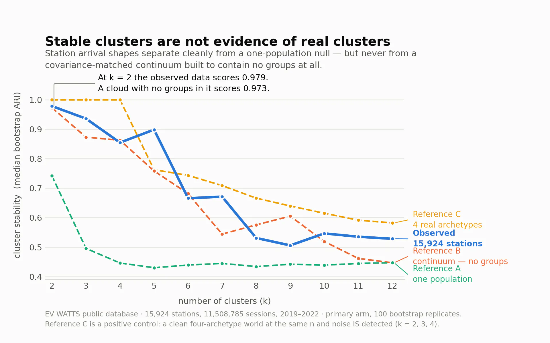
Against the one-population null, the observed stations separate cleanly at every k from 2 to 7, best margin +0.301. Against the weak null, this looks like a strong positive.
Against the continuum, they do not separate at any k. Best margin −0.013.
Against the continuum, the four-archetype control separates at k = 2, 3 and 4 — the protocol had the power and did not find one in the real data.
The number worth carrying away: at k = 2 the real stations score 0.979 on the stability measure, and the cloud with no groups in it scores 0.973.
And then one group didn't dissolve
Three of the four clusters in the k = 4 fit behaved exactly like regions of a smooth cloud. The fourth — 838 stations, about 5% of the population — did not, and a global stability curve cannot detect that, because it scores the whole partition at once.
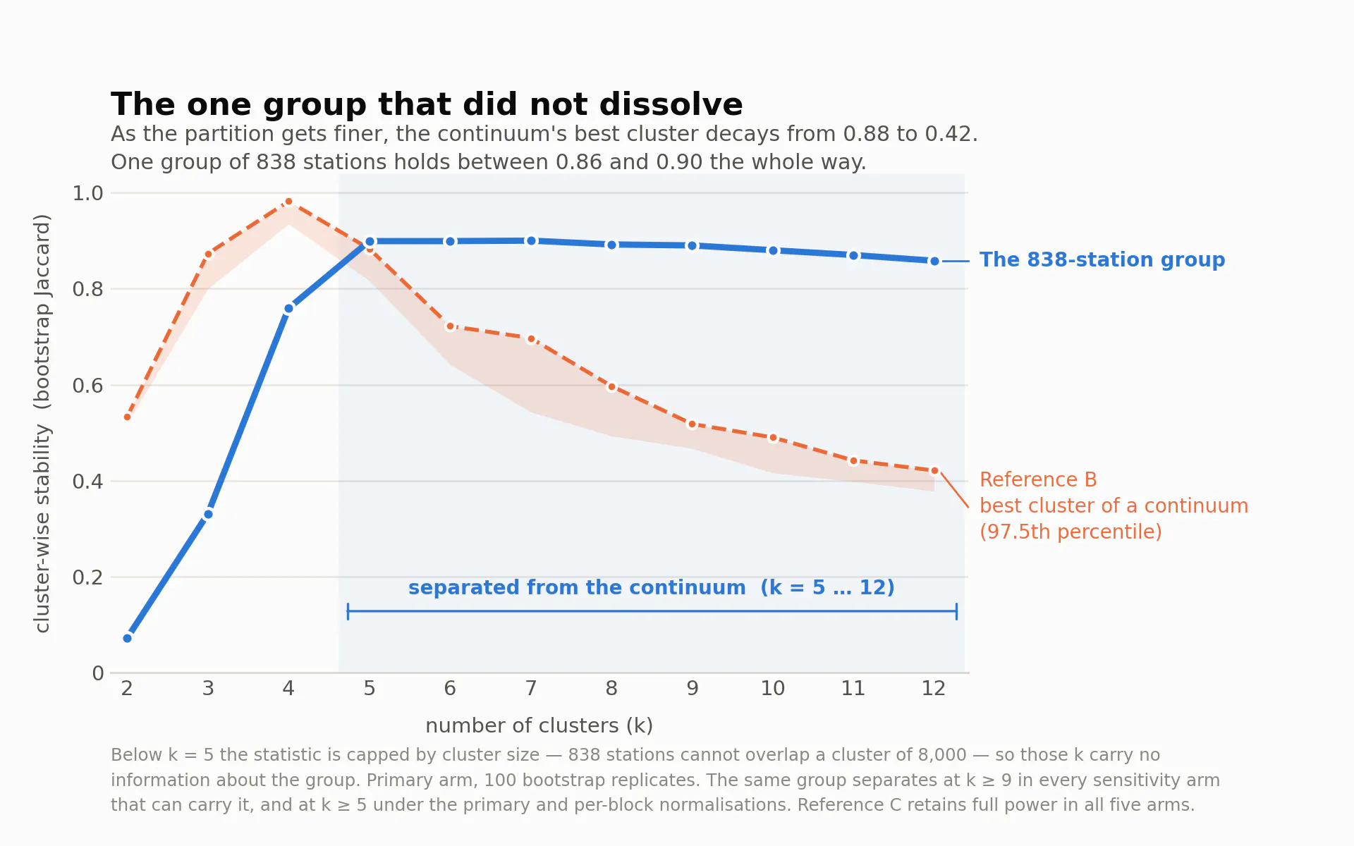
Testing that group on its own: as the partition gets finer, the continuum's best cluster decays from 0.88 to 0.42, while the 838-station group holds between 0.86 and 0.90 the whole way. It separates from the continuum across k = 5 to 12 — eight contiguous comparisons where 0.275 are expected by chance. Its leakage falls to 0.006, meaning its members are almost never assigned alongside non-members once the partition is fine enough to hold them. It stays together and it stays apart.
I then ran the sensitivity arms I had originally waived — waiving them was reasonable for a negative result and not for a positive one. No arm produced a negative and the positive control kept full power in all of them, but two arms narrow the range, so the finding should be stated with its range attached: the group separates from a continuum at k ≥ 9 under every configuration that can carry it, and from k ≥ 5 under the primary and per-block normalizations.
One arm is worth reporting for its own sake. Dropping the session threshold to 100 appears to weaken the result — the group's score falls to 0.59. Counting explains it: 833 of the 838 stations still land in one cluster, but that cluster has grown to 1,810 stations, nearly 40% of them newly admitted. The group does not dissolve at a lower threshold. More stations share its shape than the higher threshold was showing.
The hour is real. The cause is not established.
The group's arrivals concentrate in a single hour — 48.3% of them at 23:00 — and it is 99.2% single-family residential, 99.8% Level 2, 99.5% free to use, single-port.
A sharp late-hour spike is precisely what mishandled daylight saving would manufacture, so that had to be excluded before the hour could be named. A per-station screen against the real spring and autumn transitions, with placebo windows as a control, returns an estimated offset of −0.005 with a 95% interval of [−0.0075, +0.0025]; the 23:00 share is 0.643 before and 0.658 after the spring transition; 3 of 385 testable stations detect, against a 5% null. The same estimator applied to Phoenix, which does not observe daylight saving, returns +0.555. The test has power, and the hour holds.
Here is what I cannot tell you. The obvious reading is a time-of-use tariff whose off-peak window opens at 23:00. I am not making that claim, because the dataset contains no rate schedule, no tariff identifier, and no charging-network, vendor or provider field of any kind. The group could equally be one vendor's, one utility programme's, or one pilot's residential units shipped with a scheduled start — which would produce a 48% single-hour concentration with no driver behaviour in it at all.
I lean toward the second, because a 48% single-hour spike is more precise than human price response usually is, and because the group's geography is concentrated: 46.5% East North Central, with 26.5% of it in one metro area where it accounts for 26.5% of that metro's stations against 5.3% across the population.
For a rate designer that distinction is the whole value of the result. A tariff response is a measurement of demand response. A shipped default is a measurement of a procurement decision — still useful for load forecasting, but nearly worthless as evidence about how drivers respond to price. Separating them needs a source this dataset does not contain.
What this means for a forecast
It does not mean the five strategies are false. They describe drivers; I clustered stations. Those are different units. What it does mean is that the taxonomy is not recoverable from the largest public observational record of US charging that exists, which makes the mix a parameter with no observational check attached. For anyone reviewing a forecast, that is the practical finding: the assumption is not wrong, it is untestable as specified, and it should be carried as a sensitivity rather than as an input.
It does not mean charging is unstructured. The opposite. Cluster membership is strongly associated with venue — a Cramér's V of 0.685 — and with the number of ports at the station. Region and land use barely matter by comparison. Where a charger is sited predicts when it gets used. What siting does not do is sort stations into behavioral kinds — with the one exception above, which is defined by a shared hour rather than by a venue.
That points where the industry's own guidance already points. ESIG's EV Load Forecasting Guide, published in March, frames charging by siting use case — "Where the EVSE has been sited determines the type of vehicles that will charge at the station" — rather than by driver archetype, and its Best Practice 14 asks forecasters to calibrate charging profiles against real-world metered data. ISO New England's 2026 EV forecast is structurally the same: charging profiles allocating daily energy across hours, by month and day type, with no archetype mix in it at all.
The usable instruction is narrow: condition on venue and time, which are observable and predictive. Do not condition on behavioral type unless you can show the type separates from a continuum — and if you can, say which k range it holds across.
Limits, stated plainly
The dataset contains zero Tesla or NACS connectors, which bites hardest on the residential group. The group is a shape, not a count — there is no sampling frame, so "about 5%" describes this dataset's matched stations and nothing else, and no megawatt or household figure follows from it. Its boundary is soft: 695 of the 838 survive the finest partition. The public-venue sensitivity arm keeps only 4 of the 838, which is not a failure but a disclosure — this is a residential-charging finding and always was. And shapes are pooled over 2019–2022, across which I have separately measured meaningful year-on-year drift; that objection cuts sharper for the group than for the global result, because a tariff or a program has a start date.
If you review forecasts
Five questions are worth asking of any charging-archetype claim, mine included.
What null were the clusters compared against?
Was the reference variance-matched to the observed data, and what was the realized ratio?
Would the method have detected the archetypes if they existed — where is the positive control?
How many times was the selection rule applied, and how many separations are expected by chance?
Do the clusters reproduce on held-out units, and across the analytical choices you could have made differently?
All three reference generators and the stability protocol are open source under Apache-2.0 at github.com/jaksanders/evbench-null — numpy only, no charging data needed to run it, and shipped with the positive and negative controls that are what make its numbers mean anything. The cleaning pipeline carries the same licence but is not public yet; it is released with the shape library, and the same pipeline reproduces NREL's published EV WATTS utilization figures to within 2%. If you work with charging or load-shape data, the reference generators are the reusable part — I would rather the method travelled than the headline did.
EV WATTS public database, US DOE, 13.9M sessions, 2019–2022, public domain.
Full write-up and citations: https://jamesaksanders.com/2026/08/31/stable-clusters-are-not-evidence-of-real-clusters/