


In the context of the global energy transition, green hydrogen is a strategic energy carrier for hard-to-decarbonize sectors such as ammonia, e-fuels, and green steel. When a single industrial hub supplies several sectors, a key question arises: how should the available hydrogen be optimally allocated? Since different allocations can affect economic and technical performance, the goal is to identify the best trade-offs rather than a single solution. Multi-objective optimization and the Pareto frontier provide a useful framework to compare these allocation strategies and balance economic, technical, and industrial objectives.
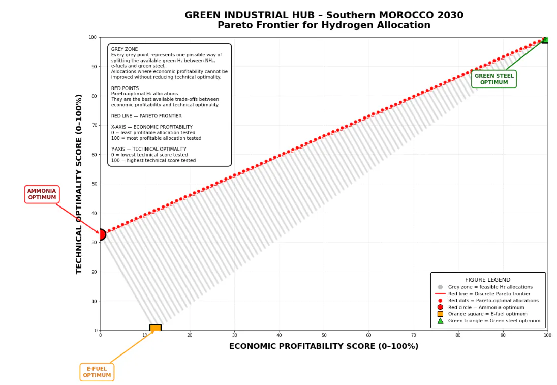
This figure answers a very simple question: “How to share green hydrogen between three plants to obtain the best possible result?”
The three plants are:
-a plant that produces ammonia (for fertilizers);
-a plant that produces e-fuels (clean fuels);
-a plant that produces green steel (steel without CO₂).
The horizontal arrow (at the bottom, from left to right) shows the money earned (profitability):
-On the left = we earn little money;
On the right = we earn a lot of money.
The vertical arrow (on the left, from bottom to top) shows technical performance:
-At the bottom = the plants operate poorly (old technology, waste, etc.);
-At the top = the plants operate very well (modern, efficient, reliable technology).
Each grey point represents a different way of sharing the hydrogen.
For example:
-one point = 50% for ammonia, 30% for e-fuels, 20% for steel;
-another point = 10% for ammonia, 10% for e-fuels, 80% for steel;
-etc.
There are thousands of grey points because there are thousands of ways to share the hydrogen.
The red points (the important points) are the best ways to share because no grey point is at the same time:
-further to the right (more money);
-and higher up (better technique).
In other words: the red points are the champions.
The red line connects the red points like a path. It shows the best possible path:
-if you want more money, you follow the line towards the right;
-if you want more technical performance, you follow the line upwards.
All the points that are not on this line are less good. They are “dominated” by the red points.
The large red circle shows what happens if almost all the hydrogen is used for ammonia. Is this point on the red line? Yes = it is a good idea to put everything into ammonia.
The orange square represents a reference situation in which the total amount of green hydrogen produced annually by the industrial hub is allocated to the e-fuels sector. Concretely, this means that 0% of the hydrogen is directed towards ammonia production, 0% towards green steel production, and 100% towards e-fuel production. For it to be truly optimal, it must belong to the Pareto frontier, meaning that no other allocation dominates it simultaneously according to the two criteria (economic profitability and technical performance).
The large green triangle shows what happens if almost all the hydrogen is used for green steel.
If the line rises towards the right (from the bottom-left to the top-right), this means that when we earn more money, we also have better technical performance. The two go together: this is a good situation with “red points”.
If the line goes down towards the right (from the top-left to the bottom-right), this means that when we want more money, we lose in terms of technical performance (or vice versa). We have to choose: money or technique? “Grey points”.
Which one is furthest to the right? = the one that generates the most money.
Which one is highest up? = the one with the best technical performance.
Which one is on the red line? = the one that is a good option.
Do you want to maximize money? → choose a red point all the way to the right.
Do you want to maximize technical performance? → choose a red point all the way to the top.
Do you want a balance? → choose a red point in the middle of the line.
-->Conclusion:
The red line rises towards the right:
-The most profitable points are also the most technically performing.
-This is good news: there is no need to choose between money and technical performance.
The green triangle (steel) is probably at the top right:
-Green steel generates a lot of money;
-And it has good technical performance.
The red circle (ammonia) is probably at the bottom left or in the middle:
-Ammonia generates less money;
-But it can have good technical performance (mature technology).
The orange square (e-fuels) is somewhere in the middle:
-Neither the best nor the worst;
-Perhaps an intermediate option.
--> What to do with this information?
If you are an investor
-You look at the red points;
-You choose the one that gives you the most money (the furthest to the right);
-You check that the technical performance is acceptable (not too low).
If you are an engineer
-You look at the red points;
-You choose the one with the best technical performance (the highest up);
-You check that the money is sufficient (not too far to the left).
If you are a policy maker
-You want a balance;
-You choose a red point in the middle of the line;
-You have both good profitability and good technical performance.
The full study is available online : https://www.calameo.com/read/00786087687a6b9ca4156